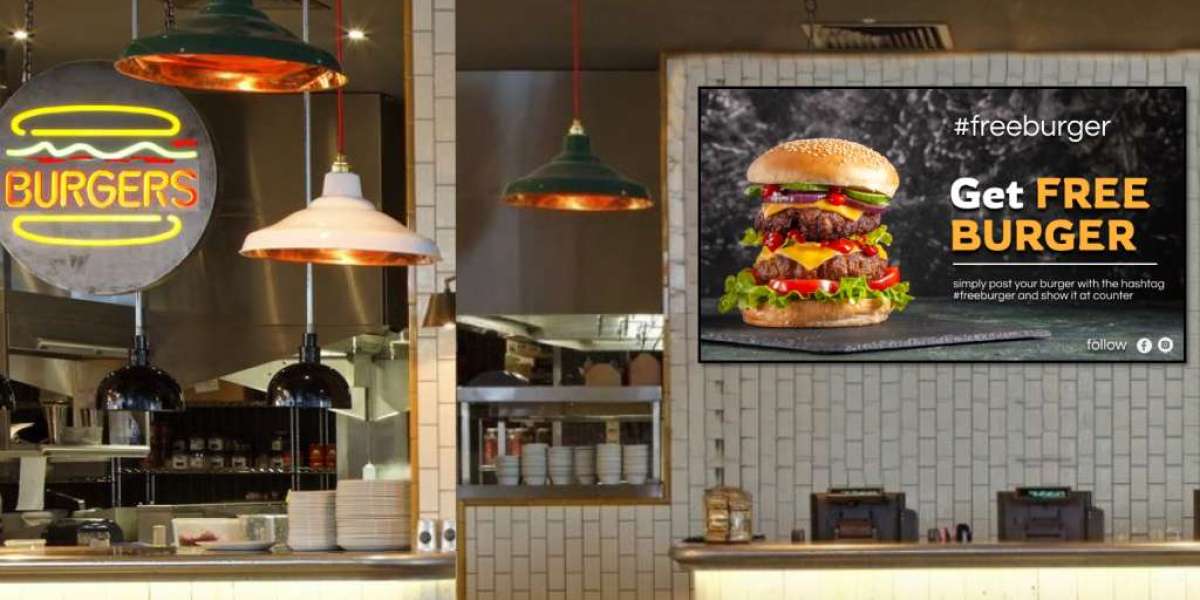
In the fast-paced world of restaurants, first impressions matter. Digital menu boards are more than just tools for displaying food items; they’re powerful marketing assets that can influence customer choices. One key factor in their effectiveness is color. Colors have a profound impact on how customers perceive food and can even stimulate appetite. Let’s dive into the psychology behind colors and how they can be strategically used on digital menu boards.
The Psychology of Colors and Appetite
Color psychology explores how different hues affect human emotions and behaviors. In the context of food, certain colors can trigger hunger, while others may dampen it. This makes color selection crucial for digital menu boards, as they directly influence customer cravings and purchase decisions. Restaurants that understand the emotional impact of colors can create menus that not only look appealing but also drive sales.
Common Colors Used in Digital Menu Boards and Their Effects
Let’s take a closer look at how specific colors influence appetite and food perception:
Red: Known for its ability to stimulate appetite, red creates a sense of urgency and excitement. This is why many fast-food chains use red on their digital menu boards to encourage quick decisions.
Yellow: A bright and cheerful color, yellow grabs attention and evokes feelings of happiness. It’s ideal for highlighting promotions or featured items on the menu.
Green: Associated with health, freshness, and sustainability, green is perfect for showcasing salads, vegan options, or organic dishes. It appeals to customers seeking wholesome meals.
Orange: Combining the appetite-stimulating effects of red with the energy of yellow, orange is great for highlighting comfort foods or seasonal specials.
Blue: Rarely used in food marketing, blue is associated with calmness and cleanliness. While it may suppress appetite, it works well for drinks, desserts, or items meant to feel refreshing.
White and Black: These neutral colors enhance readability and create a clean, modern aesthetic. They’re often used for text or to contrast against colorful backgrounds.
Enhancing Food Perception Through Color Pairing
Pairing complementary colors can elevate the visual appeal of your digital menu boards. For example, green and red create a fresh and inviting look, perfect for dishes with vegetables and meat. Similarly, yellow and orange can make warm, hearty meals look even more enticing. Strategic color combinations draw attention to key menu items and help convey the right message about your offerings.
Using Colors to Highlight Menu Sections
Digital menu boards allow restaurants to segment their menus by color, making it easier for customers to navigate. For instance:
Use green to label healthy options.
Highlight spicy dishes with red to emphasize heat and excitement.
Mark desserts with blue or pastel shades for a soothing, sweet vibe.
Colors can also guide customers’ focus to high-margin items or daily specials, driving profitability.
Dynamic Colors and Digital Display Features
One of the advantages of digital menu boards is their ability to use dynamic color transitions. Animated colors or subtle background changes can keep customers engaged while waiting in line. However, it’s important to strike a balance. Overly bright or frequently changing colors may become distracting, so use dynamic features sparingly.
Cultural and Demographic Considerations
Color meanings vary across cultures, which is an essential consideration for restaurants serving diverse customer bases. For example, while red signifies passion and appetite in Western cultures, it may symbolize prosperity and good fortune in others. Tailoring colors to your target audience can make your digital menu boards more effective and relatable.
Testing and Measuring the Effectiveness of Colors
To maximize the impact of colors on digital menu boards, restaurants should experiment and measure results. A/B testing different color schemes can reveal which combinations drive more sales or attract customer attention. Metrics to track include increased sales of highlighted items, average order value, and customer engagement time with the menu.
Conclusion
Colors are a silent yet powerful tool in shaping food perception and stimulating appetite. By understanding the psychology behind colors and strategically applying them on digital menu boards, restaurants can enhance the dining experience and boost sales. Whether it’s the appetite-stimulating effects of red or the health-conscious appeal of green, every color choice can make a difference. Experiment, analyze, and let your digital menu boards do the talking for your brand.


